
Do We Really Need Big Displays in Cars? Volvo Weighs In
- BY MUFARO MHARIWA

- 12 hours ago
- 13 min read

Editor's Note: "This is a limited series exploring one question: do we really need big screens in cars? As this trend unfolds, we’ll be speaking to key voices across leading car brands to understand the thinking behind the trend and whether it’s here to stay or ready to be left behind. For our second installment, we sat down with Volvo."
Newer cars are arriving with bigger screens, and you do not have to look far to see it. Compare the current generation of Mercedes-Benz C-Class to the one before it and the difference is night and day. Dashboards that once balanced buttons, vents and modest displays are now dominated by glass.
Volvo, however, has taken a different route. Rather than chasing size for the sake of it, the brand has remained relatively consistent with its signature vertical screen layout, choosing instead to refine the software behind it. That is not to say Volvo has stood still. In the EX30, the company even removed the traditional digital instrument cluster entirely, a move that raised eyebrows and started plenty of debate.
As screens continue to grow across the industry, and after speaking to Audi recently about some of the reasoning behind this wider shift, I wanted to hear from a brand taking a more restrained approach. So I spoke to Vusi Machie, Head of Product at Volvo SA, to talk about Volvo’s infotainment systems today, why the brand still believes in the vertical screen, and where in-car technology may be heading next.
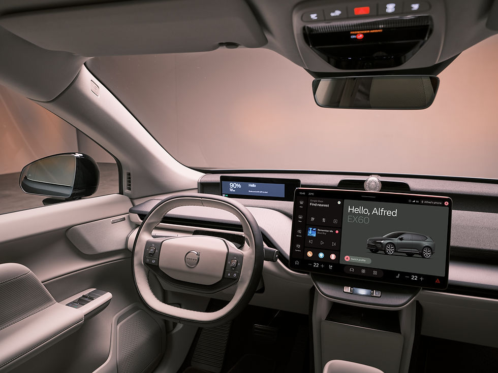
Why Volvo Has Stuck With the Vertical Screen

Vusi explained that Volvo’s portrait display was never about doing something different for the sake of it.
“This isn’t a design choice for show, it’s rooted in how people naturally interact with technology. We instinctively use our phones in portrait mode, especially when navigating information like maps or lists. Bringing that same logic into the car allows for a more intuitive and safer experience. A vertical screen enables information to be layered in a way that mirrors real behaviour, with navigation positioned higher, closer to the driver’s natural line of sight, and secondary controls like climate and media placed lower, within easy reach. By contrast, horizontal screens require more side-to-side scanning, which can momentarily take attention away from the road. Ultimately, the goal was to create an interface that feels seamlessly integrated into the driving experience, not like an add-on, but a considered extension of the dashboard.”
I completely understand Volvo’s thinking here. The idea of making a car feel natural by leaning into something we already use every day makes sense. Most people spend hours with a phone in hand, so there is comfort in that familiarity.
That said, you could flip the same argument the other way. Many people spend their working day looking at computer monitors and laptops, which are horizontal by nature. You could easily argue that a widescreen layout feels just as familiar.
Truthfully, this may come down to preference more than anything else. Both formats work. Some drivers may prefer a landscape screen that shows more information at once, while others may appreciate a vertical display that feels cleaner and less overwhelming. If the software is responsive and the layout is smart, either can succeed.'
Where Volvo deserves credit is consistency. While much of the industry has chased trends, the Swedish brand has largely stayed committed to what it knows works, refining the experience rather than reinventing it every few years.
Volvo Not Building Its Own Software System
When I asked why Volvo chose Android Automotive rather than building everything in-house, Vusi was refreshingly direct.
“Building an in-house system sounds great for control, but it usually ends up with maps that are out of date and voice assistants that don't understand you. By integrating Android Automotive, the experience is powered by familiar, best-in-class tools like Google Maps and the Play Store, natively built into the car. The real benefit to drivers is longevity. The vehicle isn’t a static piece of technology; it evolves over time. With regular updates, the system continuously improves, much like a smartphone. Ensuring the experience stays current, relevant, and intuitive long after you’ve driven off the showroom floor.”
Here is the reality. Car manufacturers are very good at making cars, or most of them are. Software is often where they remind us nobody is perfect.

Back in the day, the job was simpler. Build a solid chassis, tune the suspension, make a strong engine, sort the gearbox, done. Today, brands must also build digital ecosystems. They need to design screens, create intuitive menus, keep systems secure, keep them updated, and make sure they still work flawlessly years later.
That is no small task.
Software has to work every day, every time. It cannot freeze when you need navigation. It cannot lag when adjusting the climate. It cannot feel outdated two years after purchase. Some systems struggle because the hardware behind them cannot keep up. Others try to do too much and become overly complicated.

That is why Volvo’s Google partnership makes sense. It allows Volvo to focus on building the car itself while leaning on one of the world’s most experienced software companies for the digital layer. It also circles back to the familiarity point. Many drivers already use Google Maps, Google Assistant and Google services daily, so bringing that into the cabin lowers the learning curve.
There is also a wider market truth here. Many younger buyers are no longer led by horsepower figures or transmission types. Features like Apple CarPlay, Android Auto and a smooth infotainment experience now carry real weight. Try selling a modern car without them and see how quickly buyers lose interest.
Do We Judge Too Quickly?
When I raised the criticism around everything being controlled through the screen, especially in cars like the EX30, Vusi made it clear Volvo does not dismiss those concerns.
“At Volvo, we place immense value on the feedback we receive from our drivers. When pushing the boundaries of minimalist design, as we have with the EX30, it is natural to encounter a period of adjustment for some users. While the exceptional global demand and sales performance indicate that the car’s overall 'vibe' and value proposition are resonating deeply with the market, we never dismiss individual user experiences. If a customer finds a routine interaction to be less than seamless, we view that as a critical design challenge to overcome. Our goal is to ensure that every digital interaction feels as tactile and immediate as possible, and we are constantly refining our software to make the cabin experience more intuitive.”
I would say that as reviewers, we often overreact.
We base opinions on a short time with the car, sometimes a few hours, maybe a week if we are lucky. Then we rush to conclusions about what should be changed, what is annoying, what makes no sense. But a week is hardly enough time to truly get acquainted with something you may own for five years.

Customers live with the car. They learn shortcuts, develop habits, understand menus, and adapt in ways a reviewer simply does not have time to. What feels frustrating on day one can become second nature by day thirty.
As for removing the instrument cluster entirely, I do not think it is automatically outrageous. If you give me a proper head-up display, then fair enough. Important driving information is still in my line of sight. Remove both the cluster and a head-up display, though, and now we need a serious conversation.
Still, ownership changes perspective. Many features that seem odd at first become normal with time.
It also says something that the EX30 was the best-selling EV in South Africa in 2025, according to AutoTrader’s Industry Report. That suggests the things media people complain about may not be deal-breakers to actual buyers.
Personally, I have not yet experienced the EX30. The idea of needing to look to the centre screen for everything does irritate me on paper. But I have also driven cars I disliked initially, only to adjust quickly once I spent real time with them.
Why Volvo Moved Beyond the EX30 Layout

When newer Volvo models such as the EX90, ES90 and EX60 began showing a slightly different approach to driver information, I asked whether this was a response to feedback or simply natural progression.
“Our design strategy is not a reversal, but rather a purposeful refinement that acknowledges the diverse needs of our drivers across different vehicle segments. While the EX30 champions a bold, centralised minimalism, our flagship models like the EX90 and EX60 are designed to prioritise 'contextual' information. We have learned that true simplicity does not always require centralisation; instead, it is about delivering the right information in the right place at the right time. Whether it is the 360-degree camera for precision parking or Pilot Assist data for the highway, we are ensuring critical information is positioned directly in the driver’s line of sight to enhance both safety and ease of use.”
From the outside looking in, the EX30 does feel extremely minimalist, perhaps even too minimalist. But from the inside, I imagine the philosophy becomes clearer.
Volvo has always leaned into Scandinavian simplicity. Clean lines, calm spaces, thoughtful materials, uncluttered design. It is minimalism, but not cheap minimalism. There is still substance beneath it.
That is an important distinction.
I do not think flagship cars necessarily need more screens just because they cost more. More expensive should not automatically mean more displays. But I do think Volvo adding dedicated driver information back into the EX90, ES90 and EX60 says something. It suggests the single central screen may have been a step too far for some users.
Sales may not reflect dissatisfaction, but as Vusi pointed out, feedback matters. If enough people say a routine task feels awkward or critical information is too far from sight, smart brands listen.
There are simply some things that should remain directly in front of the driver. Speed is one of them. That is how generations of motorists have learned to drive. The most important information should be immediate, central and effortless to read.
Centralisation can look elegant in a brochure. Without a sensible compromise, such as a head-up display or dedicated cluster, it can become inconvenient in the real world.
The Move From Screens to Conversations
When I asked about the future of infotainment, Vusi did not hesitate.
“We believe we are approaching a pivotal shift where manual screen interaction, regardless of how polished the interface is, will be viewed as a legacy approach. The future lies in seamless, intuitive communication; being able to simply tell your car, 'I’m cold' or 'Find a quiet coffee shop on my route,' allows the technology to handle the task in the background. This isn't just a convenience, it is the ultimate safety feature. By prioritising voice and AI, we ensure the driver’s hands remain on the wheel and their focus stays entirely on the road. At Volvo, we are betting heavily on this vision of a more focused, distraction-free driving experience.”
He also explained why Volvo sees Gemini as a step beyond traditional voice assistants.
“Gemini represents a significant evolution beyond the rigid, 'fixed command' assistants that drivers have traditionally encountered; it is built to understand true context. Rather than requiring specific phrases like 'Set temperature to 22 degrees,' you can simply communicate naturally - saying 'I’m a bit chilly' is enough for the system to respond appropriately. We also recognise that consistent connectivity is a key concern for our drivers. To address this, we have engineered the vehicle’s core functions to remain 'on-board'. This ensures that essential features, such as defrosting your windows, remain fully operational even when driving through a dead zone. While the more complex 'genius' processing occurs in the cloud, the 'essential' systems always stay localised within the car.”

Personally, I understand the appeal of talking to your car. As manufacturers remove physical buttons and bury functions inside menus, voice control can be genuinely useful. Instead of tapping through three screens to cool your seat, you simply ask. The problem begins when the system does not understand you. Now you are arguing with a car. The music pauses, the cabin goes silent, you repeat yourself twice, and if it still gets it wrong, you are left with a warm seat and an even warmer temper.
Voice assistants often become useful only once you learn their language rather than them learning yours. You discover that “turn on front ventilation to level two” works, but “make the seat a bit cooler” confuses it. That defeats the point.
This is where Gemini could matter. AI on our phones has already become better at understanding context, pauses, accents, even someone saying “uhm” mid-sentence. If that same intelligence reaches the car properly, then the experience changes. Once again, Volvo partnering with Google looks smart.
Still, I am not ready to bury buttons just yet. A physical control is instant. No waiting, no speaking, no hoping the system heard correctly. You press, it happens. Voice assistants feel like a solution to a problem manufacturers created themselves. Many brands removed physical buttons in the name of cleaner design and bigger screens, making once-simple tasks more complicated.
Right now the industry debate is that screens are replacing buttons. But if AI keeps improving, the next debate may be even bigger: will voice replace screens altogether?
Vusi believes the role of the screen is already beginning to change.
“While screens will continue to serve a purpose for high-resolution mapping or entertainment during charging sessions, their prominence as a primary control interface is set to diminish. With the advanced processing power of HuginCore, the vehicle now possesses the internal 'brain' to manage most functions seamlessly in the background. As AI becomes increasingly conversational and intuitive, the central screen evolves from a functional 'control panel' into a refined display, to the point where a driver may not need to physically interact with it for days at a time.”
Cars Turning Into Cinemas?
While many brands continue adding more displays, Volvo has taken a different route.
“We believe that the current industry trend toward ever-increasing screen real estate can often lead to unnecessary glare and driver distraction. Our design philosophy is rooted in creating a cabin that feels like a Scandinavian living room, calm, quiet, and intentional. We have found that a single, high-quality central display is all that is required if the software is thoughtfully designed. For Volvo, the priority is always the quality of the interaction, rather than the sheer quantity of pixels.”

Cars really are starting to feel like cinemas. Personally, I do not mind a passenger screen when it serves a purpose. If the passenger can quickly enter a destination into navigation, manage media, connect their phone or handle trip settings without disturbing the driver, then it makes sense. That is useful technology.
Where it becomes strange is when passenger screens are marketed around watching films and streaming content. Rear-seat entertainment for children on a long journey is understandable. But a front passenger watching a movie while sitting next to the driver changes the mood of the journey entirely. It starts to feel less like travelling together and more like two people commuting separately in the same cabin.
To me, one excellent screen that does everything quickly and logically is better than two or three average ones.
I used to think brands were adding screens mostly to appear futuristic or different. After speaking to manufacturers, I now see another side to it. Removing rows of buttons can free up space for cupholders, wireless charging trays, storage and a cleaner cabin layout.
There is also the reality that car designers are not designing for today alone. They are designing for where the world will be years from now. And our world is deeply digital now. So from their perspective, more screens probably make perfect sense.
The challenge is making sure that sense translates to the person actually driving the car.
What Actually Makes a Great Infotainment System?
“A truly premium infotainment system is defined by speed and 'invisibility'. In our view, if a system lags for even a half-second, it has failed to meet the required standard. True luxury means never having to pause to locate a function; a system fails if it requires conscious effort to navigate. We believe the interface should remain one step ahead of the driver, proactively presenting what is needed before it is even sought. Ultimately, the technology should be so intuitive that it ceases to feel like 'tech' at all—it simply becomes a natural, integrated part of the vehicle.”

That idea of invisibility is spot on. The best infotainment systems are the ones you barely notice, because everything simply works. You tap, it responds. You search, it appears. You need something, it is exactly where you expected it to be. What annoys me most is when simple actions are buried inside menus within menus within menus.
Take something as basic as changing the layout of the instrument cluster. In many cars, an arrow key on the steering wheel or one shortcut button would solve that instantly. Yet some brands, especially newer Chinese brands chasing minimalist interiors, hide that option somewhere inside the infotainment menus. That means you can realistically only change it while stationary.
Some might say that is a small complaint. Why do you need to change the layout anyway?
Because sometimes it is not about aesthetics. Sometimes I want to quickly switch to a page showing efficiency data, tyre pressures or trip information. Those are practical things, not vanity features. If useful information is hidden behind layers of software, then the system has missed the point.
When the Brain Shapes the Body
As cars become more digitally aware, the hardware required to support that intelligence is beginning to influence exterior design in ways we have not really seen before. So I asked Vusi directly whether infotainment systems and AI-driven features could eventually shape how cars are designed on the outside, especially as more sensors and cameras become necessary.
Vusi responded:
“You are correct. One only needs to look at the 'hump' on the roof of the EX90—our integrated LiDAR system—to see this in practice. As we incorporate advanced AI like Gemini, which will eventually possess the capability to 'see' what the driver sees, the vehicle naturally requires more 'eyes'. We are entering an era where sensors and cameras are becoming the foundation of a new design language. Our challenge is to ensure these elements are integrated elegantly into the silhouette, rather than appearing as afterthoughts. It is a fascinating shift where the 'brain' of the car has begun to dictate the form of its 'body'.”

And that idea is exactly where the debate gets interesting.
I understand why sensors are necessary. They are, in simple terms, the car’s eyes. Without them, none of the advanced safety systems we now expect would exist. But I do think execution matters.
The large LiDAR “cap” on cars like the EX90 does feel a bit like a London taxi dome awkwardly placed on a modern SUV. It works technically, but visually it can feel like an interruption to an otherwise clean design.
I would rather see these systems integrated properly into the bodywork, hidden within the design rather than sitting on top of it. A car should still look like a car first, not a moving sensor platform.
That is the trade-off though.
Modern vehicles are being shaped as much by technology as they are by design language. We are already seeing it with blacked-out grilles to conceal sensors, reshaped bumpers, and more complex front-end designs just to accommodate cameras and radar systems.
What I do respect about Volvo in this entire conversation is consistency.

While the rest of the industry is chasing screen size, complexity and digital spectacle, Volvo is not letting trends dictate its identity. It is absorbing the technology, yes, but filtering it through its own design philosophy first. And in a space where everything is trying to shout louder than the next car, that restraint might be the most forward-thinking choice of all.


